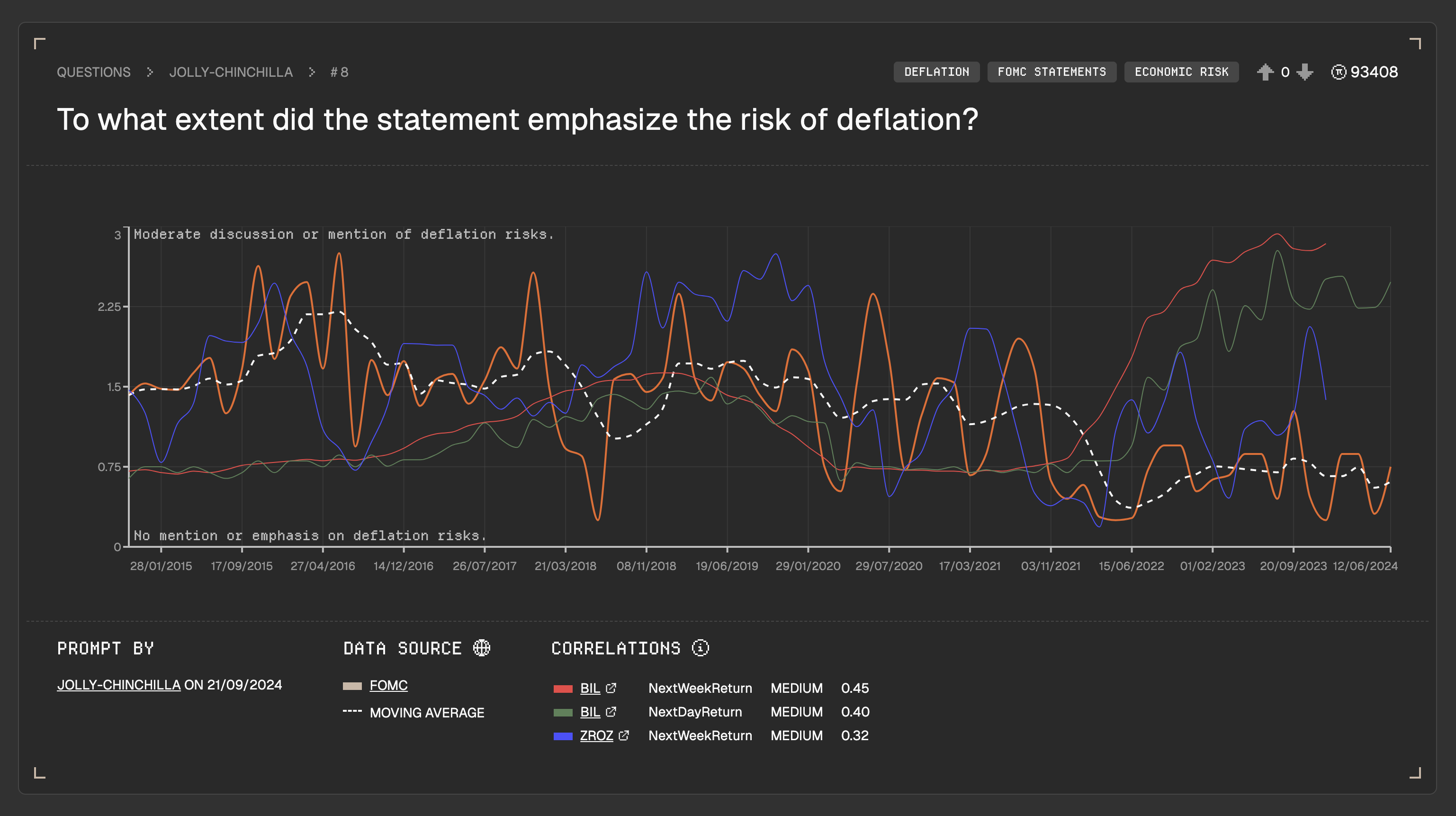
# Time Series
Pi transforms text-based information into visual data using advanced AI. After processing a user's question, the system generates a comprehensive timeseries chart. Here's a breakdown of the key elements:
Let's break this view down.
## Question Display
* At the top, you'll see the original question that prompted the analysis.
## User Voting System
* Users can upvote or downvote each timeseries.
* This feature helps highlight the most intriguing analyses.
* Each user is limited to one vote per timeseries.
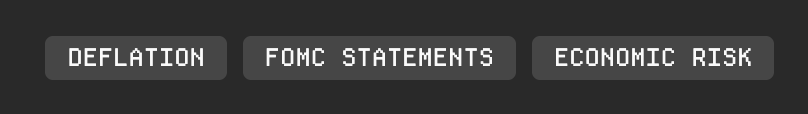
## Tag Classification
* Up to three tags are assigned to each timeseries.
* Click on a tag to discover related timeseries with the same classification.
## Interactive Chart
* The main gold line represents the timeseries data for the question.
* A 10-period Moving Average is also displayed for trend analysis.
* The left Y-axis label indicates the measured variable.
* Scale annotations explain the significance of extreme values.
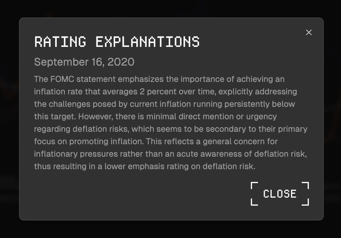
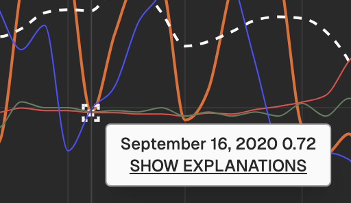
### Chart Details
* For detailed information, click on any data point to view:
* The specific date
* An explanation for that particular rating
## Correlations
Once your unique timeseries has been created, we start crunching vast datasets to look for correlations.
If any are found, the ticker (with a link to yahoo finance), the type of correlation, strength and correlation rating are displayed.
[Find out more about correlations.](#correlations)
## Recommendations
At the bottom, you'll find recent questions with similar tags, encouraging thematic exploration. This layout is designed to provide a comprehensive view of the analysis while facilitating further investigation into related topics.
---
# Agent Instructions: Querying This Documentation
If you need additional information that is not directly available in this page, you can query the documentation dynamically by asking a question.
Perform an HTTP GET request on the current page URL with the `ask` query parameter:
```
GET https://docs.pi.crunchdao.com/basics/openapi.md?ask=
```
The question should be specific, self-contained, and written in natural language.
The response will contain a direct answer to the question and relevant excerpts and sources from the documentation.
Use this mechanism when the answer is not explicitly present in the current page, you need clarification or additional context, or you want to retrieve related documentation sections.